This is how i organised my versions. this is important so i could go back to earlier versions of my pages if i changed something i didn't like or i gained negative feedback so i had to change something. This can also be used to show the client my progression
Front cover V1:
V3:
V4:
I changed the filter on this photograph to fit with indie magazine conventions more as the B&W makes the photograph look more grunge.
First DPS V1:
First DPS V2:
First DPS V3:
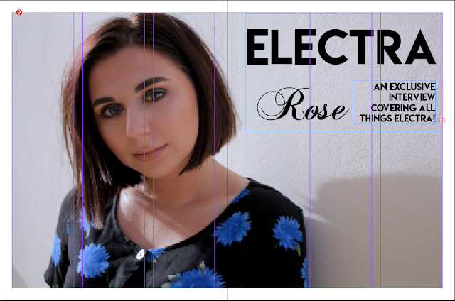
First DPS V4:
First DPS V5:
First DPS V6:
I changed the photograph to make Electra look cooler and appeal more to the audience as an ideal self/partner. I also changed the layout to fit more with the conventions of a magazine
First DPS V7:
First DPS V8:
First Title page V1:
First Title page V2:
First Title page V3:
First Title page V4:
I decided to add a blue colour to reflect her name 'Electra'
First Title page V5:
First Title V6:


No comments:
Post a Comment