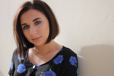
Original photograph:
During editing:
Final edit:
original photograph:
During editing:
Final edited draft:
This photograph was taken at close up wide shot, this was so the audience could connect with the artist and recognise her so if they see her in the future they will know who she is. i used a cooling filter on her to compliment her with the blue/black dress on and against the white background, this reflects her as an ideal self/partner.
Original photograph:
Final edited draft:
Original photograph:

Final edited draft:
The model is wearing a dark top, denim skirt and ripped/fishnet tights, this makes her relatable to the audience as they would wear clothes like this. By adding a cooling filter onto the photograph it fits with the indie genre as from photographs i have looked at most of them use cooling, black and white or sepia filters.


No comments:
Post a Comment