This is my masthead. Again I used a sans serif font not only to stand out but to also give it a modern feel to attract a slightly younger audience. i made the masthead black/white to stick to conventions of an indie magazine as magazines such as NME and Kerrang use black/white mastheads.
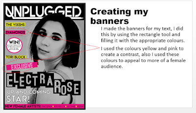
I used these banners to make the text standout against the background and create a contrast. I used the colours yellow and pink to stand out, this are almost neon colours which gives connotations of energy and excitement. The neon colours can relate to the signs/colours the audience may see when they are at gig venues, this reaches to a music based audience.


No comments:
Post a Comment