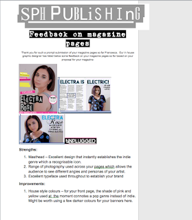
I got feedback from both my target audience and the client.
Based on my feedback I can see that the strengths of my current magazine are the photographs and layout as they appeal to the audience but it needs to look more indie. i intend to do this by changing the edit photograph on the front cover to black and white to make her look more edgy. i could also change some of the fonts to make them stand out more.
This is my client feedback:
based on this feedback i can make changes to parts of my magazine so it is satisfactory for my client (sph publishing)
These are my results from my target audience:


No comments:
Post a Comment