I have been asked to create a Sheffield based magazine. The
name of my magazine is Unplugged, this links to the type of magazine (indie
rock music) but also to the gossip/information about the bands in the magazine.
I edited my masthead from a masthead from dafont.com, I changed the colour and
added a cord like underline as I wanted it to fit with the conventions of an
indie music magazine.

Here the font after I added the cord underline, this was to link to music
and being plugged-in. I added this cord by using the rectangle tool, to add the
point to the end I removed part of the rectangle on either side.

Here I changed the colour of the text and cord using the paint bucket
tool, this was so when I applied the black background it would stand out and
create a contrast. I also used this as it fits with the conventions of indie
magazines as they mainly use black/white mastheads.
My magazine consists of a front page, a contents page and a double
page spreads. For my front cover have feature a solo female artist, I wanted to
feature a female artist on the front to attract a more female audience, this is
because most of the indie rock magazines on the market are based around males. My
artist to be dressed in a dark top, denim skirt and ripped tights, this is to
connote the rock lifestyle and relate to the audience. These clothes would
relate to the audience because it most of the audience would wear clothes like
these, also this relates to Denis McQuail’s theory (1972) as this states the
audience form a personal identity based on what the artist is wearing. For my
female artist created a star persona to fit in with the indie-rock theme, I
wanted her to look like artists such as Marina and The Diamonds, Lana Del Rey
or St. Vincent. I took my photograph against a plain white background in deep
depth of field, this is so the artist stands out and is the main focus, I also
took the photograph at a medium close up, this is because I wanted her to be
clearly visible to the audience. When editing my I used a black and white
filter, this was to produce a dark and moody persona to fit with the indie
genre.


i used the B&W filter and then adjusted the levels, this again was to deepen the photograph but also to take out any grey tones left as it could wash her out. this is what gave her the intense look on my front cover.
I used a female artist to reach out to a primarily female audience aged 16-21 because not that many indie rock magazines target this type of audience, this makes the artist an ideal self/partner to the audience. Anchored to this photograph of my female artist I have her name “Electra Rose” along with “Exclusive” and “up and coming star” this makes the reader want to buy my magazine as they feel like they are getting exclusive/secret insight on this artist.On my front cover the font is a san serif and bold, I also wanted to keep the colour on the masthead as black and white, this is because a lot of the indie rock magazines I have looked at they use black and white for this, as well I think the black in the font draws more attention to the main cover image. My masthead has the name of my magazine (Unplugged). On my front cover to have additional cover line which will day “new female artists”, I created these artists based on the audience (16-21 females) and type of music they are interested in (indie rock), I have include this section as most indie magazines do not feature female artists. I have artist’s names such as “Siena” “Phoenix” “Leonie” and “Vix Kelly”, this is displayed in a pink box with black text, this makes it stand out against the rest of the front cover. On the front cover I also included graphics to show giveaways/competition, this is to attract the audience and make them want to read my magazine, the giveaway includes a free tickets to Electra gig.The house style for my front cover is pink, black, yellow and white. I tried target both male and female audience (although mainly females) I do this by using colours such as black and pink which shows the audience that this magazine is aimed at both male and female, this is because blue/black is stereotypically for boys and pink is stereotypically for girls. Although my magazine to targets a more female audience, it can still target males as well, this is to widen my audience.
I used Electra Rose
on my contents page aswell. Initially I was going to have a boy band on the
contents page, although I changed this as I wanted this to be a primarily
female based magazine to reach a female audience. The Housestyle colours are
the same as the front cover, throughout the magazine will be kept the same on
my contents page, this reaches out to more of a younger female target audience
but also creates a brand throughout my magazine. I included a big image of the
Electra, this photograph was taken outside in natural lighting, she is sat on a
wall looking directly into the camera, this was taken at a medium close up,
this is to create emotion with the audience which makes the audience want to
read more. Alongside the headline of each article included a small description
of it, this again draws the reader in as they see a variety of artists
featured. Also by the small description of the articles I included page
numbers, this is because this provides easy navigation around the magazine for
the audience.
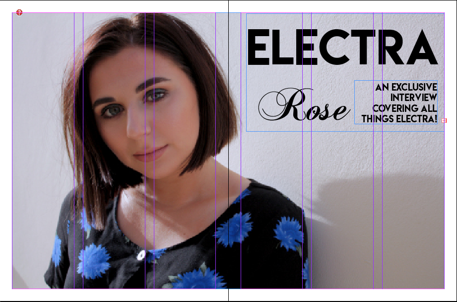
I first introduced Electra Rose with a title page. Across
both pages is a photograph of her, this photograph is taken at a wide close up,
this was so she was seen and recognisable to the audience as her face was clear.
I took the photograph at a shallow depth of field against a plain wall, this
was so all of the focus was on her. In the white space on the right hand side
of her I put her name ‘Electra Rose’, this was so the reader knew her name,
this was anchored to the photograph. Underneath her name was ‘an exclusive
interview covering all things Electra!’, this explains what the article is
about.
 i used the text tool to create the coverlines here, i filled them with black and outlined them with blue, this was to stick with housestyle colours. i used two different fonts for 'Electra Rose' this was to make her look delicate and to create a contrast in her name.
I used colours of blue throughout both this page and the dps, this links to her name being Electra, this name his connotations of bright, electric, energy which I felt the colour I used conveyed. I used the same colours and fonts throughout so that it created a brand for the artist and the magazine.

I used colours of blue throughout both this page and the dps, this links to her name being Electra, this name his connotations of bright, electric, energy which I felt the colour I used conveyed. I used the same colours and fonts throughout so that it created a brand for the artist and the magazine.
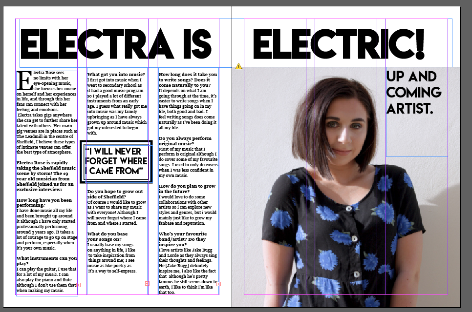
My first dps is on the female artist, this is to open the market for indie rock for girls as it attracts more of a female audience. My female artist is called “Electra Rose”, I choose this name as “Electra” has connotations of brilliant and bright, also it has connotations of lights and stars which could tell the audience how big of a star she will me, therefor showing her as an ideal self/partner. There is a big image of her on the left page, she is sat on a wall, posed facing the camera, this is so she is recognisable to the audience, and also this connotes emotion to the audience and helps them connect with her. She will be dressed in the same clothes as on the front cover, this is so she is recognisable to the audience. My pull quote for this article is “Electra is Electric!”.

i used this text to look like neon lights/wires, this was to again reinforce her name, here i was editing her name to make it bigger and bolder. i decided to take the word 'electric' across both pages to link the photograph to it.
I want to keep with the housestyle by using colours of white, blue and black, this links to her name and matches her clothes, I used this on both the title page and the DPS, this was to create a brand. The questions I used have a peer-to-peer mode of address, this fits in with the stereotype about female conversations and makes the conversation more relatable to the audience.